Armor Management Portal V2
My role:Product Design, Creative Direction, Design Systems | Industry: Cybersecurity, SaaS, PaaS
The Armor Management Portal (AMP) was due for a modern look and a change in the information architecture of the layout. However, this was just not a design refresh. After much feedback from our customers we understood that we needed to re-categorize our services and features. This also made our navigation much simpler and less clutter on the page resulting in more data for our users. Another request from customers was a dark theme that we implemented in tandem with The Armor Design System.
Process
Here are a few solutions that I came up with during the redesign process.
Problem
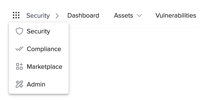
A very complex navigation that didn’t scale well with our products. We discovered from usability that things were hard to find in the long list of navigation items.
The old navigation that didn’t scale well.
Solution
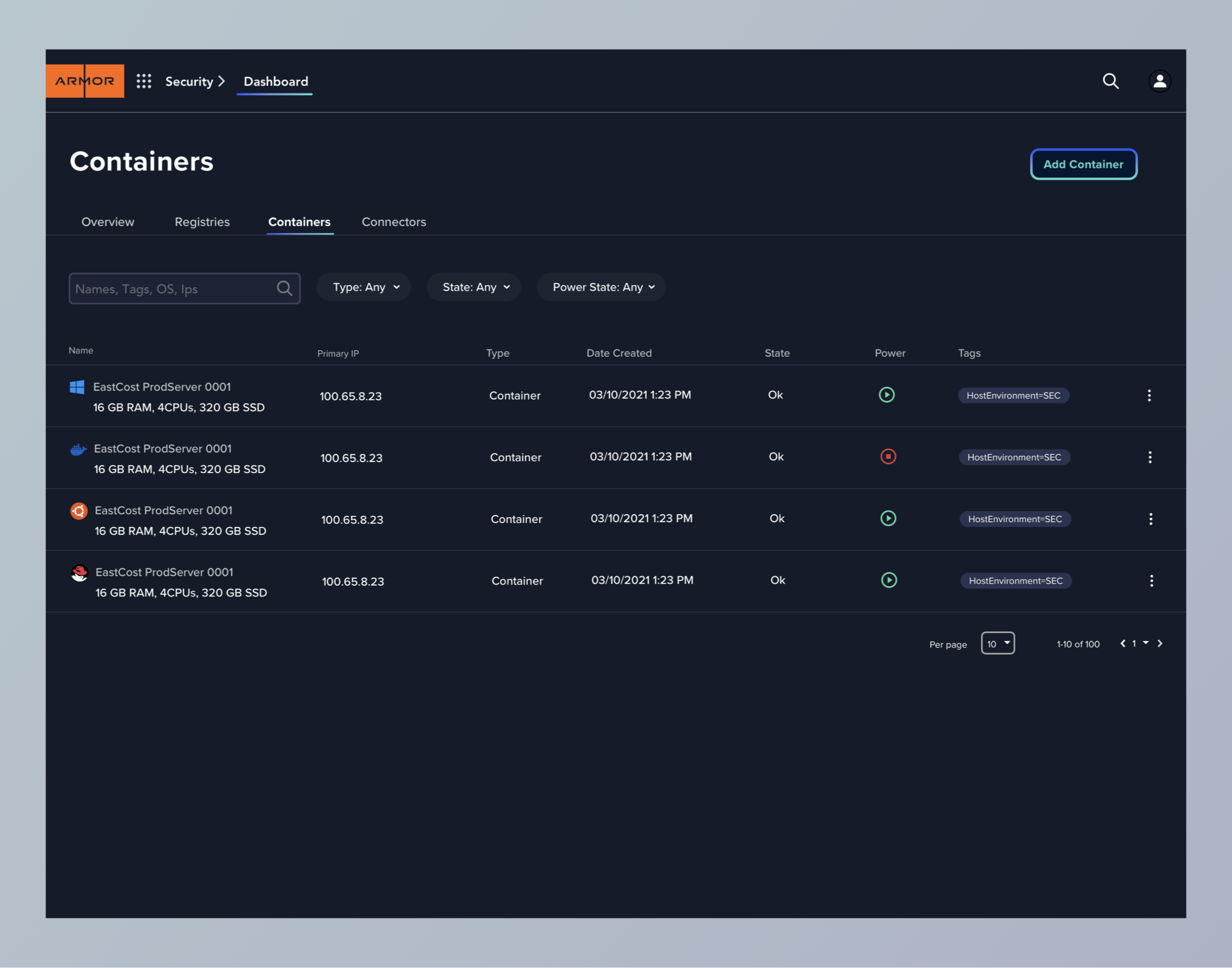
A better understanding of Information Architecture and scaling contributed to the new navigation contained in “apps”. In apps a user has the relevant child sections. See an example of this in use.
Result: Less cognitive load
Simplified Navigation contained in “apps”.
Problem
Messaging and icons weren’t very clear. AMP used a combined scoring system of three different sections of the platform. On each page a different score was displayed depending on your security posture.
Confusing messages and alerts.
Solution
Messages that are direct by utilizing a scoring system from 1-10.
Result: Less Friction Points
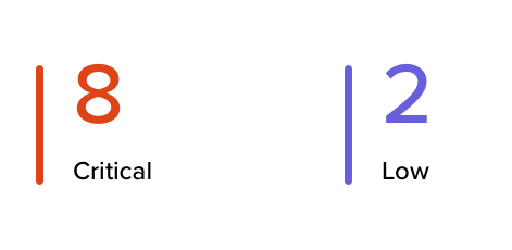
Easy to understand alerts.